Countries
A complete rebuild of the REST Countries challenge into a production-ready React application. The project combines normalized API data, URL-driven search and pagination, resilient routing, persistent themes, accessible interactions and careful performance work across mobile and desktop.

Adrian Nasrat
Explore the finished application and its source code:
From frontend challenge to production application
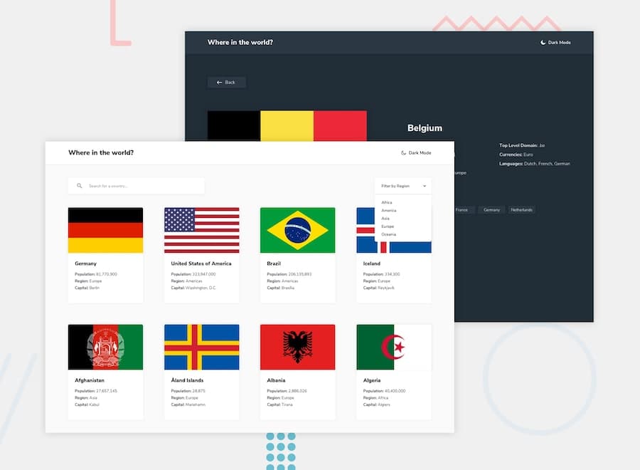
Countries began as a Frontend Mentor challenge: fetch country data, provide a search field, filter by region and display a detailed country view. I used the brief as a starting point, then rebuilt the project as a complete product rather than treating it as a static implementation exercise.
The finished application lets users browse 250 countries, combine search and regional filtering, move through paginated results and navigate directly between bordering countries. Search, region and page values are stored in the URL, so a filtered view can be refreshed, bookmarked or shared without losing its state.
The product goals
The central challenge was not simply displaying API data. The experience also needed to remain predictable as users searched, changed pages, opened a country and returned to the result they had been viewing.
I defined five goals for the rebuild:
- Preserve context: filters, pagination and scroll position should survive navigation to a country and back.
- Design mobile first: cards, controls and detail views should reflow cleanly without compressed layouts or horizontal scrolling.
- Treat accessibility as architecture: semantics, focus management, live announcements and reduced motion should be part of the implementation.
- Handle external data defensively: incomplete records and failed flag images should never break the interface.
- Ship a production build: routing, metadata, caching, error states and loading behavior should work outside the local development environment.
A stable data and routing architecture
Country data is requested through a dedicated API layer and normalized before it reaches the interface. This gives the components a stable internal model even when the external response contains missing or differently shaped values. The same layer caches successful results and deduplicates concurrent requests, which avoids repeated network work when moving between the overview and detail pages.
let countriesCache = null;
let countriesRequest = null;

export async function fetchCountries({ force = false } = {}) {
  if (!force && countriesCache) return countriesCache;
  if (!force && countriesRequest) return countriesRequest;

  const request = fetch(COUNTRIES_API_URL).then(async (response) => {
    if (!response.ok) {
      throw new Error("Failed to fetch countries");
    }

    const countries = await response.json();
    return countries.map(normalizeCountry);
  });

  countriesRequest = request;

  try {
    countriesCache = await request;
    return countriesCache;
  } finally {
    if (countriesRequest === request) {
      countriesRequest = null;
    }
  }
}
React Router drives both page navigation and the state of the country list. A URL
such as /?search=sw®ion=Europe&page=2 fully describes the current view.
Pagination changes intentionally return the user to the filters, while browser
Back navigation restores the exact scroll position they left behind. Direct
routes such as /country/SWE also work after a refresh through the production
Vercel rewrite configuration.
const [searchParams, setSearchParams] = useSearchParams();
const searchQuery = searchParams.get("search") ?? "";

function handleSearchChange(value) {
  setSearchParams(
    (currentParams) => {
      const nextParams = new URLSearchParams(currentParams);

      if (value) {
        nextParams.set("search", value);
      } else {
        nextParams.delete("search");
      }

      return nextParams;
    },
    { replace: true },
  );
}
Designing for every viewport
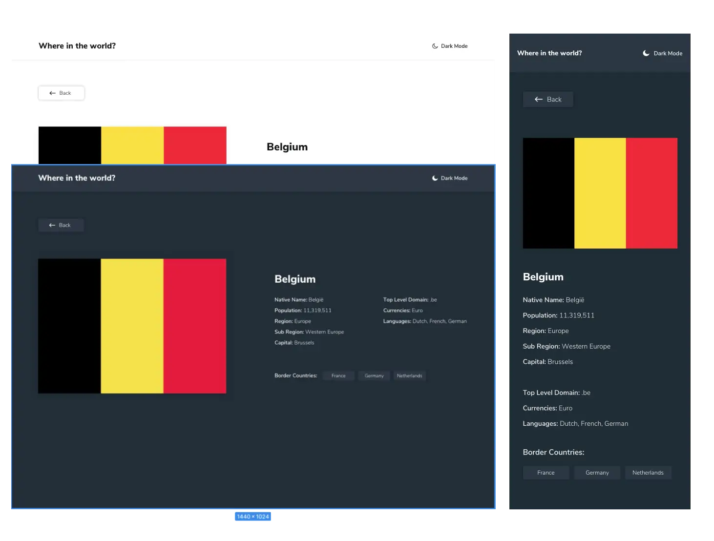
The responsive system uses one shared page container for the navigation, filter controls, country grid, loading states and country details. This keeps every screen aligned and prevents individual pages from developing slightly different widths or padding rules.
The country grid progresses deliberately from one to four columns rather than using unpredictable automatic sizing. Flag areas use controlled aspect ratios, cards maintain consistent proportions and the detail layout only becomes two-column when there is enough room for both the flag and information panel.
Theme without compromise
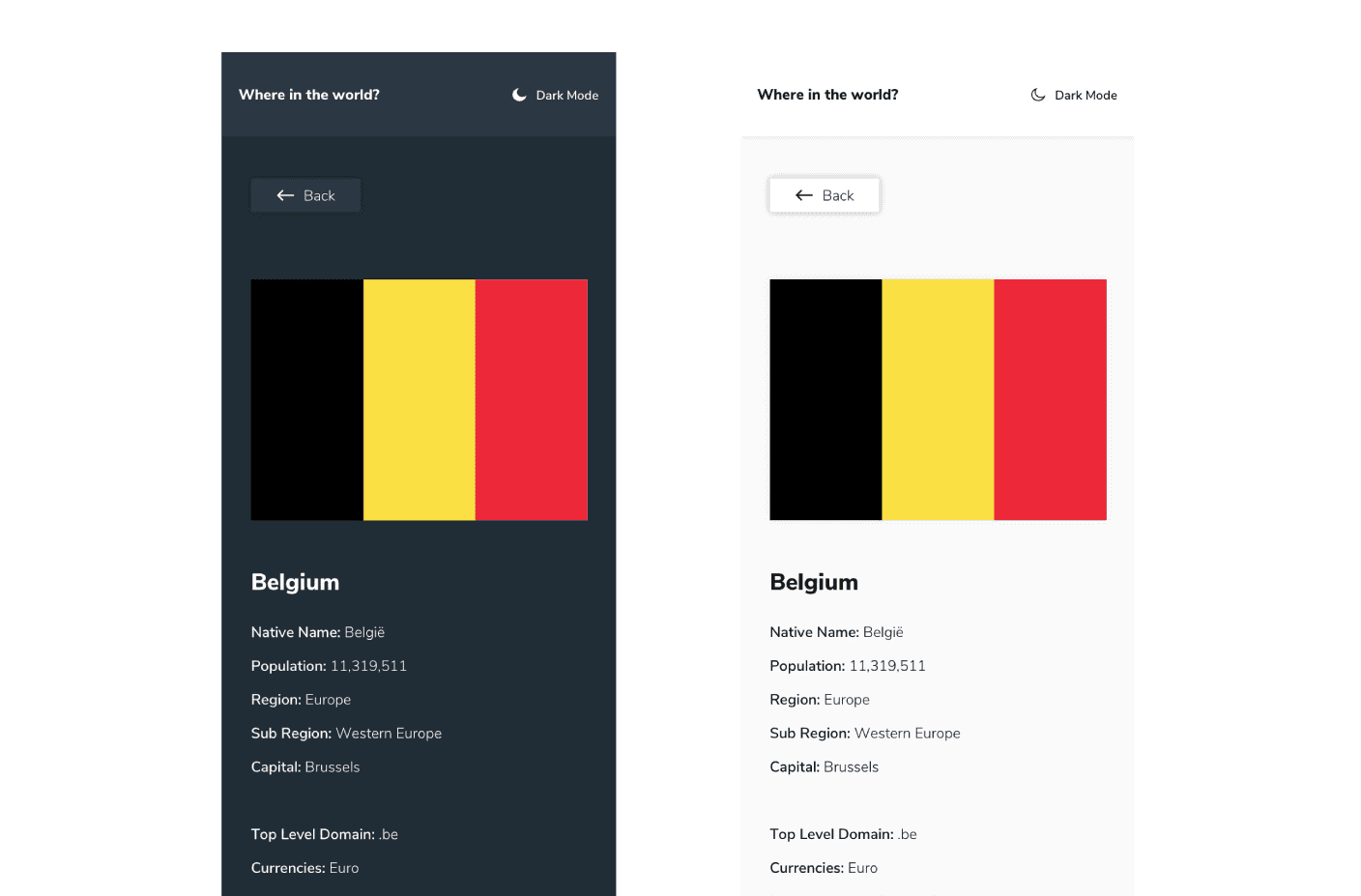
The theme toggle supports explicit light and dark preferences while respecting the operating system when the user has not made a choice. An explicit selection is persisted in local storage and applied to the document before React renders, preventing a flash of the wrong theme during reloads.
Every elevated surface, control, skeleton, error message and focus indicator was reviewed in both themes. The result is one coherent interface rather than a dark palette applied only to the main screens.
Accessibility built into the interaction model
The application was audited as a keyboard, screen-reader and reduced-motion experience and not only as a visual interface. The implementation includes:
- semantic headings, forms, lists and named navigation landmarks;
- a skip link and managed focus after route navigation;
- visible focus states for every interactive control;
- live announcements for result counts and empty states;
- descriptive flag alternatives and accessible pagination states;
- animations that respect
prefers-reduced-motion; and - complete mobile reflow without horizontal scrolling at 320 pixels.
During the production audit, Lighthouse scored the deployed application 100 for accessibility, 100 for best practices and 100 for SEO.
Performance and resilience
The Home, Country Details and Not Found routes are loaded as separate bundles. Above-the-fold flags receive higher loading priority, later images are lazy loaded and decoded asynchronously, and preconnections reduce the setup cost of external requests. Flag rendering also falls through multiple image sources and finally to a readable fallback instead of exposing a broken image.
Loading skeletons mirror the final grid to reduce layout movement. Failed API requests produce a focused error state with retry support, missing country values receive clear fallbacks and unknown URLs render a dedicated 404 page.
The production Lighthouse audit reached a 93 performance score, with zero total blocking time and zero cumulative layout shift in the measured run.
Technology and responsibilities
- React 19 for component composition and application state
- React Router 6 for data routing, URL state and navigation restoration
- Vite 8 for development and optimized production builds
- Tailwind CSS 4 for the responsive design system and theme variants
- countries.dev for country information and flag sources
- Vercel for deployment, SPA rewrites, caching and response headers
I owned the complete implementation: interface architecture, responsive design, API normalization, navigation behavior, accessibility, animation, performance work, deployment configuration and production verification.
Outcome
What started as a compact API challenge became an exercise in building a mature frontend experience. The most valuable outcome was learning to treat seemingly small behaviors such as restoring scroll position, preserving filters, announcing result changes and handling failed images as core product requirements.
The result is a responsive and resilient country explorer that remains easy to use across devices, input methods, themes and navigation paths.